Why This Tutorial Exists Right Now
Canva template sellers keep running into the same problem: the product may be useful, but the shop still looks like a pile of unrelated screenshots. That is why a brand kit matters. It gives you one visual language for the whole shop, which is useful when the marketplace feels crowded and buyers are comparing a lot of similar digital products at the same time. Current seller chatter keeps circling the same theme. People want to know why some new Canva template shops seem to move faster, why some shops look more legitimate on first glance, and how to stop a storefront from feeling generic. The answer is rarely a clever hack. It is usually a stronger system.
Etsy and Canva both point in the same direction. Etsy keeps emphasizing consistent brand design, readable product photography, and a clear buyer experience. Canva keeps making it easier to organize brand assets and preview designs before publishing them. If you stitch those two ideas together, you get a beginner-friendly workflow: define a small identity for one product lane, use it everywhere, and make your listings feel like they belong to a real shop instead of a random download folder.
This tutorial is for that exact use case. You are not creating a giant design system. You are building a practical brand kit that helps one Etsy shop feel cohesive across listing images, product files, cover slides, download instructions, and follow-up assets. The goal is to reduce friction for the buyer and reduce decision fatigue for you.
What A Canva Brand Kit Actually Fixes
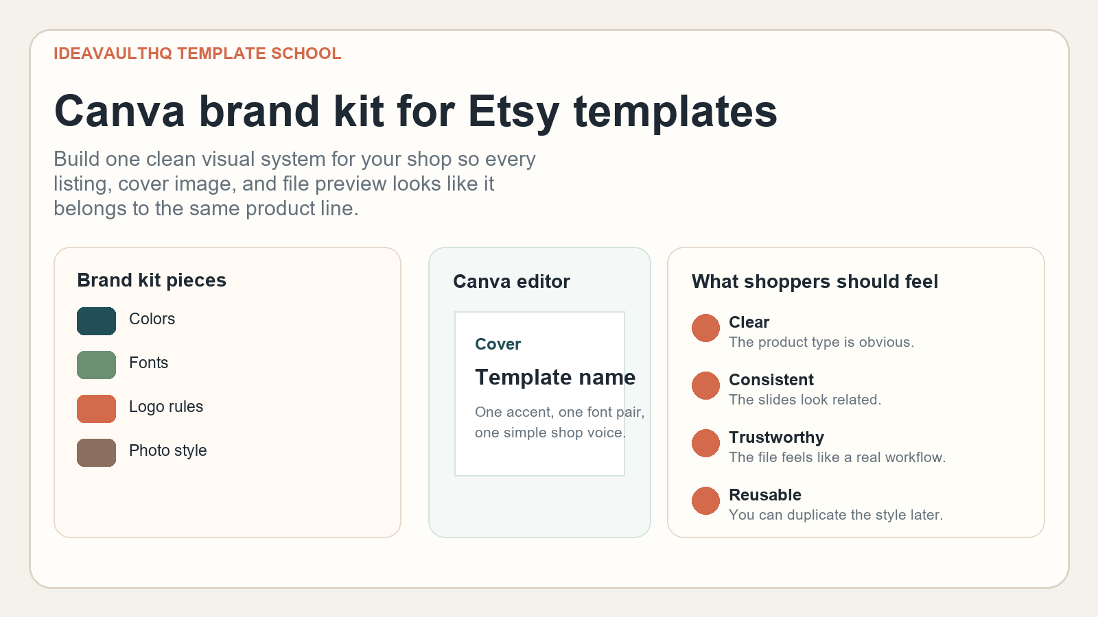
A brand kit solves the feeling of visual drift. Without one, every new template starts from scratch. One listing uses a navy headline, the next listing uses a beige serif, the next listing uses pastel gradients, and the next listing feels like a different shop entirely. That inconsistency makes it harder for buyers to remember you, harder for your listings to feel trustworthy, and harder for you to scale a product line without redesigning the world every time.
With a brand kit, the process becomes smaller and sharper. You decide the color range once. You choose two fonts once. You decide what a cover slide looks like once. You set rules for spacing, contrast, icon use, and photo style once. After that, each new template only needs to fit the system. Beginners usually underestimate how much time this saves. The payoff is not just aesthetics. It is speed, clarity, and a lower chance of shipping something that looks half-finished.
For Etsy template shops, the kit also helps with product clarity. A buyer does not want to decode a visual puzzle. They want to see what the file is, who it is for, and how it works. A clean brand system makes those answers easy to present in the preview images and the download files. That means fewer confused messages and a better first impression before the customer ever opens the template.
Pick One Product Lane Before You Design Anything
Do not build a brand kit for “everything I might sell someday.” That is how beginners end up with muddy identity choices and half-used palettes. Start by choosing one product lane. It can be Canva planners, social media templates, budget trackers, digital worksheets, wedding templates, content calendars, teacher resources, or any other digital product category that makes sense for your skill set. One lane is enough. In fact, one lane is better because it gives the brand kit a job to do.
Your lane should have a buyer you can describe in one sentence. For example: a brand kit for minimalist budget planners aimed at people who want a calm-looking finance tracker; or a kit for bold Canva templates aimed at Etsy sellers who want bright listing images and quick edits. Once you know the buyer, the style decisions get easier. Calm product? Use softer colors and simple spacing. High-energy business template? Use stronger contrast and more obvious structure. The visual system should reflect the use case, not your mood on the day you designed it.
A useful test is this: if you cannot explain the product in one sentence, you do not need a brand kit yet. You need a product lane. Once the lane is clear, the brand kit becomes a tool for repeating that decision across every future asset.
Build The Visual Rules In Plain English
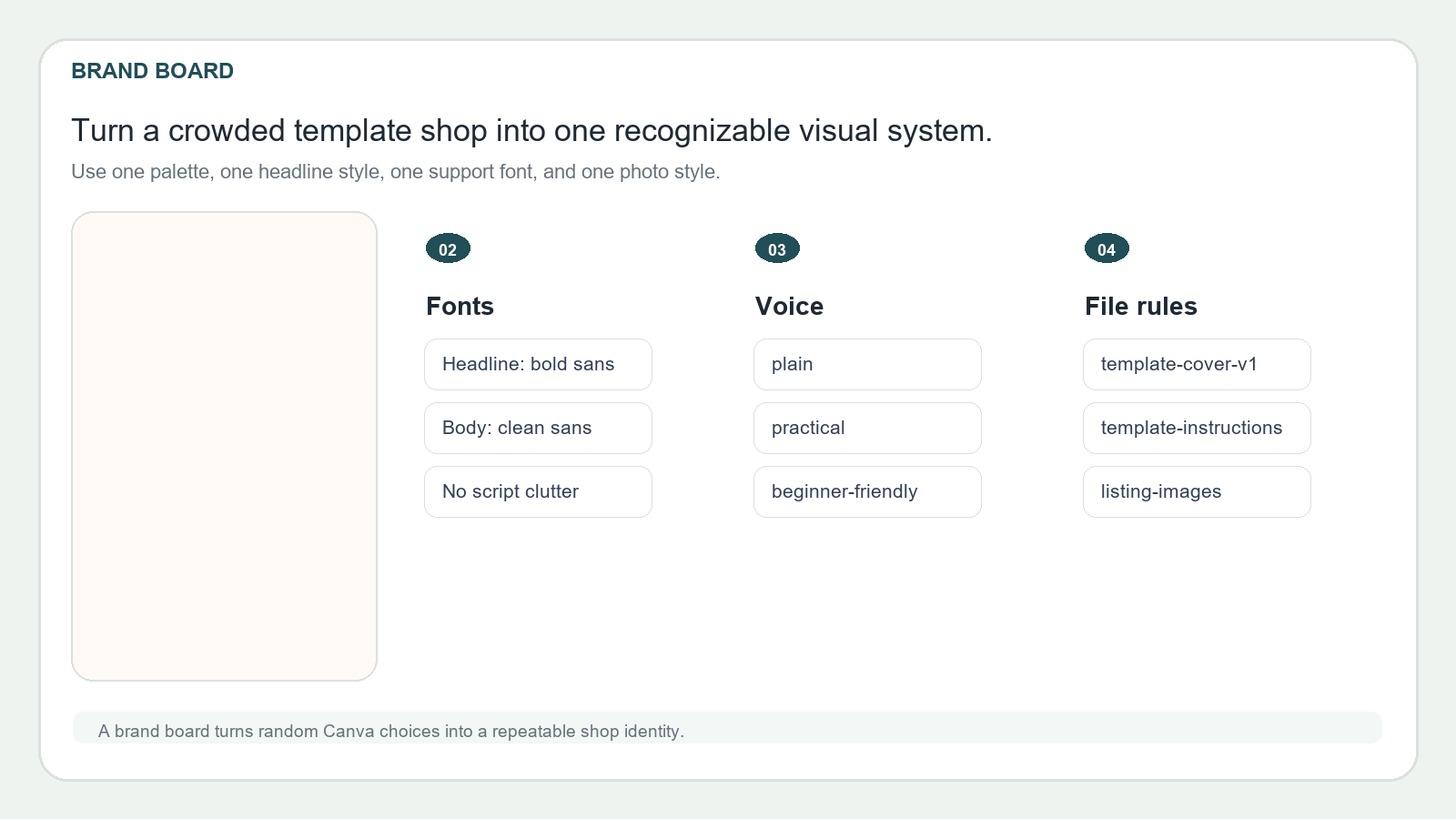
A beginner brand kit should not be a giant creative brief. It should be a small set of rules you can actually remember. Start with colors. Choose one primary color, one accent, one neutral background, and one dark text color. That is enough for most Etsy template shops. If you need more than four colors to explain the product, the system is probably too busy.
Then choose fonts. One bold headline font and one clean body font are usually enough. The headline font should be easy to read at thumbnail size and strong enough to carry the listing cover. The body font should be neutral and should not fight the layout. If you are tempted to use a script font because it looks “cute,” try it only if it remains readable on a phone. Many template shops look more expensive the moment they stop using decorative fonts everywhere and start using one calm, repeatable pairing.
Next, write your shop voice in short phrases. Think “plain, helpful, direct” or “calm, organized, practical.” This matters because your copy should match the design. A cluttered brand voice forces cluttered visuals. A clean voice makes the whole shop easier to trust. Keep the rules short enough to read in under a minute. If the brand kit itself feels like homework, nobody will use it twice.
Set Up Your Canva Brand Assets So You Can Reuse Them Fast
Open Canva and create a dedicated brand folder or brand kit area for the shop. Put your logo lockup, color codes, headline font, body font, stock icons, and a few example textures in one place. If Canva offers a brand kit builder or brand asset tools in your account, use them. If not, build the same structure manually in a master project. The important part is not the feature name. The important part is that every reusable asset lives in one obvious place.
Keep the assets practical. Do not stuff the kit with twenty colors and six fonts. Put in the few items you will actually use. Add export versions of your logo in light and dark variants. Add a simple cover badge. Add one or two divider shapes. Add a note card style if you plan to include instructions. Add a thumbnail layout for listings. You are not building a museum. You are building a production folder.
This is also where you should think about consistency across mockups and downloads. If the product file has one palette and the listing images use a different palette, the shop starts to feel disconnected. Keep the assets aligned. The buyer should feel the same visual logic in the product preview, the download, and the shop banner. That repetition is what makes the shop look cohesive instead of improvised.
Turn The Brand Kit Into A Master Template File
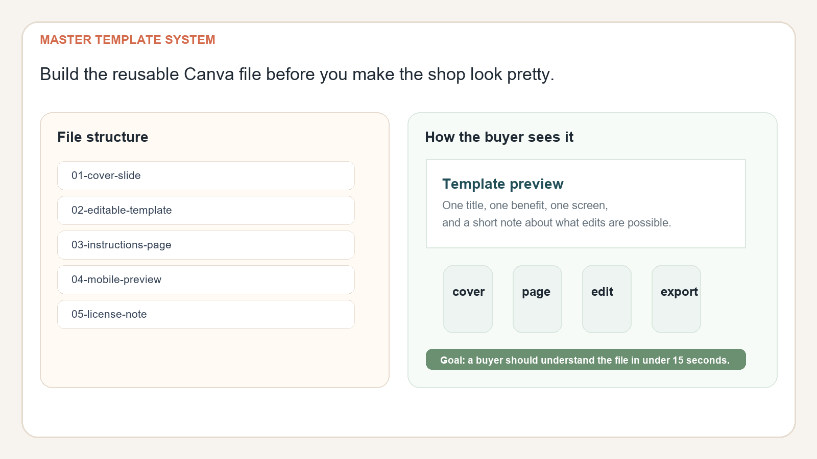
The fastest way to make the brand kit useful is to turn it into a master Canva file. That file should include the cover slide, an editable content page, an instructions page, and one or two alternate layouts. Create the file once, then duplicate it for every new product. If you sell planners, this might mean monthly, weekly, and daily pages. If you sell social templates, it might mean a title slide, a post slide, a carousel slide, and a recap slide. If you sell worksheets, it might mean a question page, an input page, a notes page, and a results page.
Save the file with a clear naming pattern. Use a product family name, a version number, and a status label. For example: budget-planner-master-v1, content-calendar-master-v1, or client-intake-template-master-v1. That makes it much easier to find the right file later and to tell whether you are using the latest version. A good naming system is boring, but it protects your time. It also prevents the common beginner mistake of exporting five nearly identical files with names no one can decode.
Inside the master file, build the layout with repeatability in mind. Keep the header style fixed. Keep the spacing fixed. Keep the callout boxes fixed. When you later build a new product, you should only need to replace the sample text, swap the screenshots, and tweak one or two accent details. That is how one brand kit turns into many products without turning your shop into visual chaos.
Use The Brand Kit To Make Listing Images Easier To Understand
Your Etsy listing images should not be random decoration. They should follow the same visual rules as the product file. That means the hero image uses the same headline font and the same accent color as the product. The supporting images use the same spacing and the same general tone. The buyer should be able to tell, even without reading the description, that the file and the listing belong to the same shop system.
Start with one hero image that says exactly what the product is. Then use the next images to prove value. Show the page structure. Show the editable area. Show the benefit. Show a result. If the product is a template, include one slide that shows a realistic finished example. If it is a planner, show one filled-out page. If it is a sheet, show the tab names and a sample input field. That is how you move from “nice design” to “clear product.” Etsy shoppers usually reward clarity faster than they reward novelty.
The brand kit helps because it removes decision noise from the image set. You are not inventing a fresh style for every listing. You are repeating a known pattern. That makes your shop look more deliberate and helps buyers recognize your work when they scroll past future uploads. Recognition is a quiet advantage, but it compounds.
Why Buyers Pay More Attention To Cohesion Than To Cleverness
Buyers usually do not say, “I want a coherent brand system.” They say things like “I want something that looks professional,” “I want a template that is easy to edit,” or “I need a planner that does not feel messy.” Cohesion is the invisible thing behind those preferences. It tells them the product is organized, the seller knows what they are doing, and the file will probably be easier to use than a sloppy alternative.
This is especially relevant in crowded categories like Canva templates and digital downloads. Search results often look crowded because so many shops use similar themes and similar mockups. When a shop has a consistent brand kit, it can stand out without shouting. The difference is subtle: the colors match, the headings are aligned, the product previews look like they came from the same designer, and the download instructions do not feel like an afterthought. That subtlety matters because buyers are often making fast decisions.
Consistency also makes upsells easier. If one product performs well, you can spin out a companion template, a bonus worksheet, or a bundle that fits the same visual world. That means each product strengthens the next one instead of competing against it. A cohesive shop is easier to expand.
How To Use ChatGPT Without Making The Work Generic
ChatGPT can help you move faster, but it should not decide your visual identity for you. Use it to brainstorm variations, create a first draft of your brand rules, or turn a rough idea into a clearer shot list. Then you make the final call. The model is useful for speed and structure. It is not useful if it replaces your judgment and turns your shop into another generic template clone.
One good use case is prompt-driven naming. Ask ChatGPT for product lane names, file name patterns, listing image outlines, or beginner-friendly instructions. Another good use case is copy cleanup. Feed it a rough product description and ask it to simplify the language so a beginner buyer can understand it faster. You can also ask it to create a checklist for your export process or a short “what is included” section. The trick is to keep the prompt specific enough that the output is tied to your exact product family.
The safest habit is to review everything against a simple question: does this line help the buyer understand the file faster? If the answer is no, edit or cut it. Fast AI output is not the goal. Clear buyer understanding is the goal.
Build A Simple Launch Routine And Keep Improving It
Once your brand kit is in place, do not let it sit unused. Put it to work on one actual listing. Publish the product, then observe how people respond. If the listing gets clicks but not sales, the issue may be the hero image or the title. If buyers ask repeated questions, the issue may be the description or the instructions page. If the product sells but looks disconnected from the rest of the shop, you probably need stronger consistency in the next version.
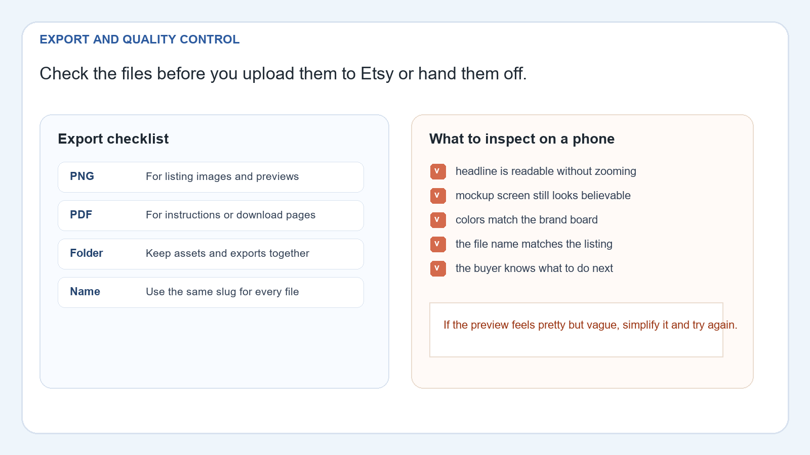
A beginner launch routine can be simple: pick the product, duplicate the master file, apply the brand kit, export the listing images, write the listing copy, and review everything on a phone-sized screen. Then compare the live listing to the old one. The best insight usually comes from noticing what became easier to understand. That tells you which parts of the system are working and which parts need a tighter visual rule.
Over time, your goal is not to design more. Your goal is to design less while keeping the shop stronger. A good brand kit gives you a reusable path. Once you have it, every new product becomes faster to build, easier to explain, and more likely to feel like part of a real shop instead of a one-off download.
Risks, Limits, And What To Improve Next
A brand kit will not fix a weak product. If the template itself is confusing, if the worksheet does not solve a real problem, or if the listing promise is too vague, then better colors alone will not save it. The brand kit is a support system, not a magic spell. It helps good products look clearer. It does not turn a bad product into a great one.
Another risk is overdesign. Beginners often add too many fonts, too many accent colors, and too many decorative elements because they want the shop to feel creative. In practice, that usually makes the shop harder to trust. Simplicity is often the better signal. A buyer who sees one calm style used across the shop is more likely to believe the seller is organized and professional. That is a strong advantage in a crowded niche.
The next improvement after your first version is usually a tighter system, not a bigger one. Remove extra colors. Simplify the cover slide. Reduce the number of layout variants. Save one or two reusable visual patterns and commit to them. That is how a beginner shop becomes a repeatable product machine without losing clarity.
How To Get Started Today
- Pick one Etsy product lane and write it in one sentence.
- Choose four brand colors and two fonts you can repeat.
- Create a master Canva file with a cover, a sample page, and an instructions page.
- Duplicate the file into one real listing and export the first preview set.
- Read the listing on your phone and remove anything that is not helping a buyer understand the product.
Workflow
Choose one product lane and buyer type.
Write the colors, fonts, and file rules.
Create the master Canva template.
Inspect the listing on a phone-sized screen.
Upload, verify, and keep the system for the next product.
Beginner Checklist
- One clear product lane
- One color palette with four colors
- One headline font and one body font
- One master Canva file with repeated layouts
- One listing image set with a clear hero image
- One export folder with readable file names
- One phone check before publishing
Copy-Paste ChatGPT Prompt
Use this prompt to plan your brand kit before you build it:
You are my Etsy template shop assistant. I want to build a Canva Brand Kit for this product lane: [insert your product lane].

Help me create:
1. A four-color palette
2. Two font pairings that stay readable on mobile
3. A short brand voice guide for listing copy
4. A master Canva file structure with 3 to 5 pages
5. A clear hero image concept for Etsy
6. A phone-check checklist for quality control

Keep everything practical, beginner-friendly, and specific to Etsy digital products.
Idea Tags
Continue Learning On IdeaVaultHQ
This guide is part of the IdeaVaultHQ Template School path. Keep going with the next practical tutorial instead of stopping at one file.
Source Links
- Canva Help: Set up Brand Kits
- Canva Help: Set up your Brand Kit automatically
- Canva Help: Manage brand assets in Canva
- Etsy Seller Handbook: Developing a Brand Design Palette
- Etsy Seller Handbook: The Ultimate Guide to Branding and Customer Service
- Etsy Seller Handbook: Why Product Photography Is Important
- Public demand signal: How Are New Canva Template Shops Getting So Many Sales?
- Public demand signal: Need advice on niching down.
Continue Learning On IdeaVaultHQ
This guide is part of the IdeaVaultHQ Template School path. Use the links below to keep moving instead of stopping on one article.
Leave a Reply