IdeaVaultHQ Template School
How To Create Etsy Listing Images in Canva That Explain Digital Downloads Fast
A practical tutorial for creating Etsy listing images in Canva that explain digital products clearly, look realistic on mobile, and support a real sales workflow instead of a vague mood board.
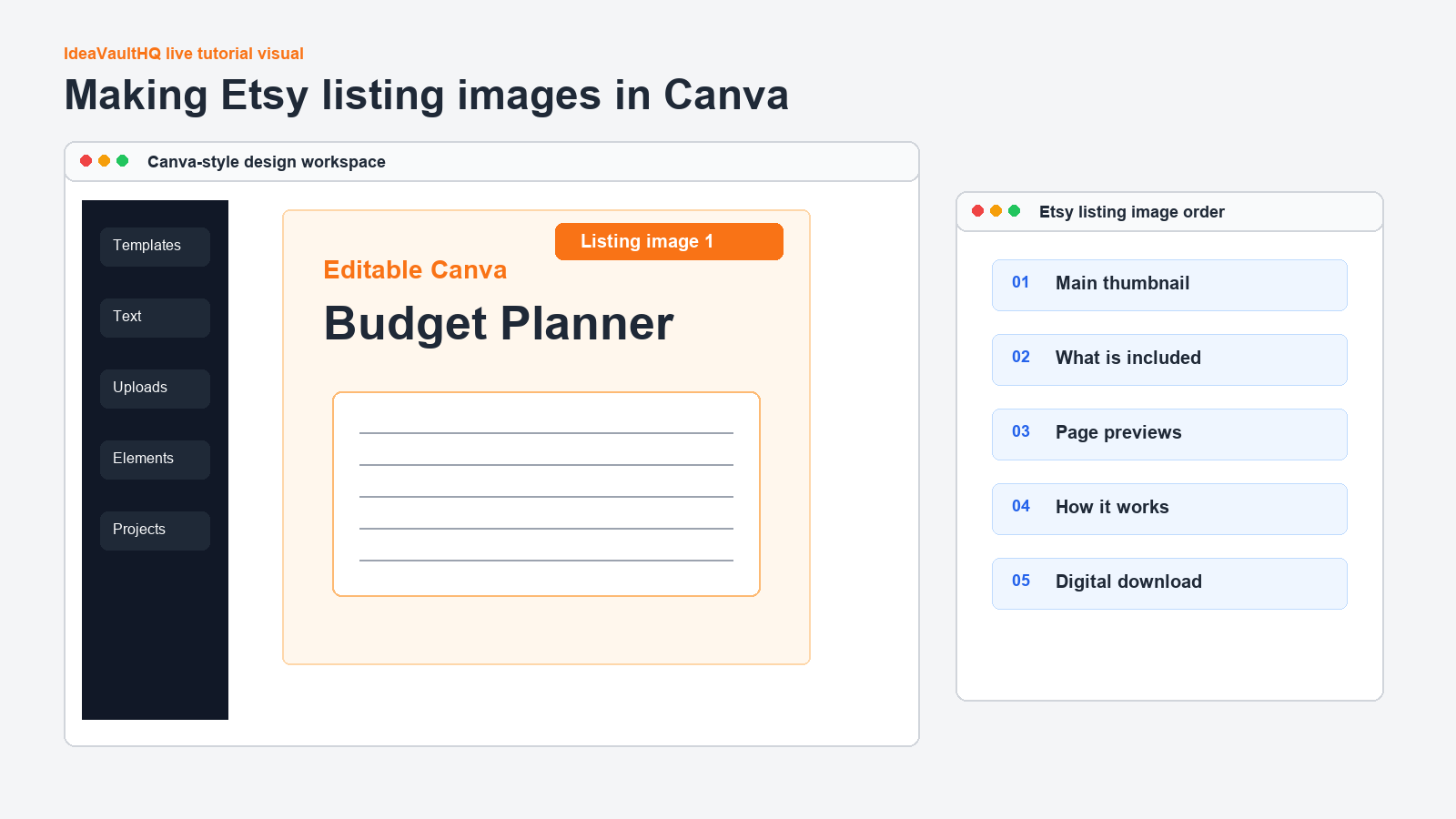
Quick answer: The best Etsy listing images do one job each. The first image says what the product is, the next images show what is included, the following images show proof and how it works, and the last image answers who the product is for. If you build that sequence in Canva with readable text and honest screenshots, buyers can understand the product in a few seconds instead of having to guess.
This tutorial is based on a real public demand signal. Recent Etsy seller discussions kept circling around the same issue: buyers do not always notice whether a product is editable, printable, or something else entirely. Sellers also kept saying they rely heavily on listing photos, search visibility, and off-site traffic because the thumbnail and gallery often decide whether a shopper clicks. That is not a formal market study, but it is enough to justify a tutorial on making listing images that explain the product clearly and fast.
It also lines up with official guidance. Etsy’s help docs explain that tags help shoppers find relevant listings, and Canva’s Etsy size guidance reminds creators to keep images large and clean enough to stay sharp. The practical lesson is simple: your photos should support the search terms, not fight them. If the title says editable Canva template, the first image should not look like a print-only file. If the product is a spreadsheet, the images should show the tabs and formulas, not a lifestyle collage that hides the actual file.
What Listing Images Need To Do
Listing images are not decoration. They are the buyer’s first explanation of what the product is and whether it will solve a specific problem. That matters even more for digital products because the buyer cannot hold the item, inspect paper quality, or flip through a physical sample. In a digital listing, the image has to carry more of the burden. It has to replace the questions that a buyer would normally ask in a store.
That means every image should answer one basic question. What is this? What do I get? How do I use it? Is it editable? Is it printable? Does it work for beginners? If an image does not answer a real question, it becomes noise. Beginners often make the mistake of designing pretty cards that never get to the point. Pretty can help, but clarity is what closes the gap between interest and purchase.
For this tutorial, think like a buyer who is scrolling on a phone and comparing five similar listings in a row. They are not trying to admire the design. They are trying to figure out which listing feels easiest to trust. If your image sequence makes the file type, the value, and the next step obvious, you are helping the buyer make a decision faster. That is the entire job.
Start With One Buyer Question
Before you open Canva, write one sentence: what must the buyer understand in three seconds? For an editable template, it might be, “This is a Canva template, not a finished PDF.” For a planner, it might be, “This includes monthly pages, not just a single cover.” For a spreadsheet, it might be, “This already has formulas and tabs set up.” That one sentence becomes the spine of the entire image set.
This step keeps you from wandering into generic branding. A lot of new sellers start by picking colors and icons because Canva makes that easy. But the design should begin with the buyer’s uncertainty, not your aesthetic preferences. If the product solves a problem for beginners, the visuals should behave like a patient teacher. They should slow the shopper down just enough to understand what they are buying.
Write a tiny brief in plain language. Example: “Editable Etsy listing image set for a budget planner that targets beginners who want less clutter and more explanation.” Or: “Square Canva cards for a digital product that should feel like a realistic tutorial screen, not a mood board.” That brief tells you which details matter. It also helps you decide what to leave out.
Map The Five-Image Sequence First
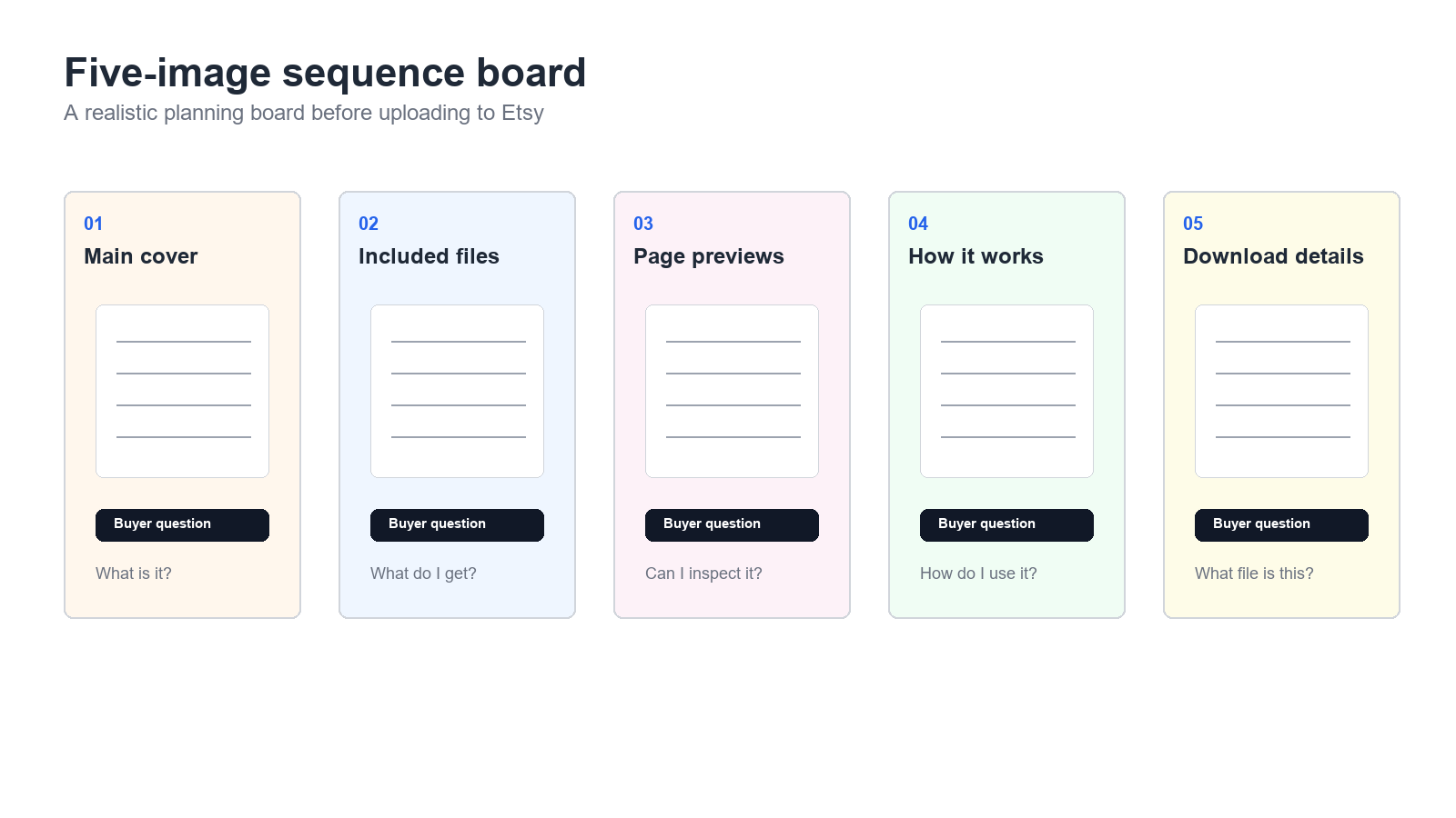
Do not design image one until you know what image five will say. A five-image sequence prevents random filler and helps each card earn its place. A beginner-friendly sequence usually works like this: image one says what the product is, image two says what is included, image three shows the actual file or page preview, image four explains how it works, and image five answers who it is for or why this version is better than a generic alternative.
That sequence matters because each image has a different job. If image one tries to explain everything, it becomes cluttered. If image two is only another cover in a different color, it adds nothing. A good sequence moves from definition to contents to proof to use case. It gives the buyer a path instead of a pile of information. That path is what makes the listing feel easier to trust.
Sketch the five cards on paper or in Notes before you start designing. Write one headline for each card, one supporting line, and one visual idea. This step takes a few minutes and saves you from over-designing later. It also makes the product easier to repeat. Once you know the sequence, you can reuse it for Canva templates, budget planners, Etsy SEO sheets, prompt packs, trackers, or any other digital product that needs the buyer to understand the file fast.
Build Image One: The Clear Promise
Image one needs to do the heaviest lifting. It should tell the buyer what the product is and what outcome they should expect. Keep the headline short and direct. “Editable Canva Budget Planner Template” is better than a poetic line that sounds nice but hides the file type. If the product is a digital download, say that. If it is a printable PDF, say that. If it includes a spreadsheet, say that. Clarity wins.
In Canva, start with a square canvas and build a simple frame: headline, subtitle, a product mockup or screenshot, and one trust line. The trust line can say “Instant digital download,” “Made for beginners,” or “Editable in Canva.” Do not pile on six icons or a fake lifestyle scene unless those elements actually help the buyer understand the file. The best first image reads like a clean answer, not a commercial break.
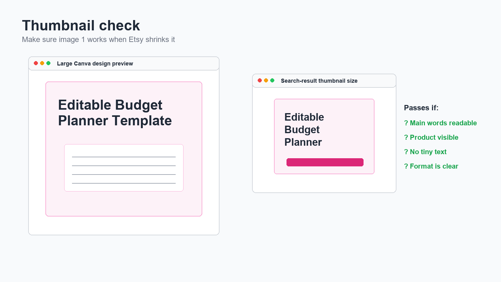
Use one readable font for the headline and one lighter font for the supporting line. Keep the contrast high. Then zoom out until the design is thumbnail size. If the headline still reads at that size, you are on the right track. If it disappears, simplify. The thumbnail is the first test, not the last one. A beautiful card that cannot be read in search results is doing the wrong job.
Show What Is Included Before You Show Fancy Branding
Image two should show what the buyer gets. This is where you can list page counts, file types, bundle contents, or included sections. If your product is a template pack, show the number of templates or the main categories. If it is a spreadsheet, show the tabs. If it is a prompt pack, show the categories of prompts. Buyers trust listings more when they can see the contents instead of being asked to infer them.
Image three should show proof. In a digital product listing, proof usually means page previews, screen mockups, or close-up layout shots. This is the place for a screenshot-style visual rather than a lifestyle collage. A buyer wants to know whether the planner has enough writing space, whether the template is clean, and whether the product structure makes sense. A realistic file preview answers those questions faster than a decorative image ever will.
When you write the overlay text, be specific. Use phrases like “7 editable pages,” “PDF plus Canva link,” “Google Sheets with formulas,” or “Includes instruction page.” Those phrases are not hype. They are practical information that reduces confusion and refund risk later. If the buyer cannot tell what is inside, the listing images have failed even if the art direction looks polished.
Explain The Process And The Buyer Fit
Image four should explain how the product works. New buyers often do not understand the workflow for a digital product, especially if it is a template. Show the path in plain language: buy, download, open, edit, save. If the file is a Canva template link, make that path visible. If it is a printable PDF, show the print path. If it is a spreadsheet, show the open-and-copy step. The goal is to remove the small question marks that block a sale.
Image five should speak directly to the right buyer. This is where you narrow the audience instead of broadening it. For example: “Made for beginners who want a simple budget system,” or “Best for Etsy sellers who need fast product mockups,” or “Designed for template creators who need cleaner listing photos.” That final card helps the buyer self-select. It also protects you from vague traffic that clicks but never buys because the product is not actually for them.
Think of the last card as the “why this version” card. You are not just saying what the file is. You are saying why your version is easier to use than a cluttered generic alternative. That difference can be small. Maybe your version has larger text. Maybe it has fewer pages. Maybe it uses plain English. Maybe it includes a printable and editable version together. In digital products, small usability improvements often decide the sale.
The Workflow At A Glance
Workflow
The five-step image workflow
Make The Visuals Feel Like Real Work Screens
The best tutorial visuals do not look like abstract AI cards. They look like actual work screens. Use browser windows, file folders, export checklists, listing draft screens, and product boards. Even when you use mockups, the mockup should still feel like something a seller would actually use. A buyer should be able to imagine themselves in the workflow instead of feeling like they are looking at a poster.
That means using contained panels, visible borders, and honest spacing. Put each mockup in a frame. Add a checklist where it makes sense. Show labels that look like the kinds of notes a real seller would make. A useful tutorial image has enough texture to feel practical, but not so much clutter that the information disappears. If you have to choose between decorative mood and screen clarity, choose screen clarity every time.
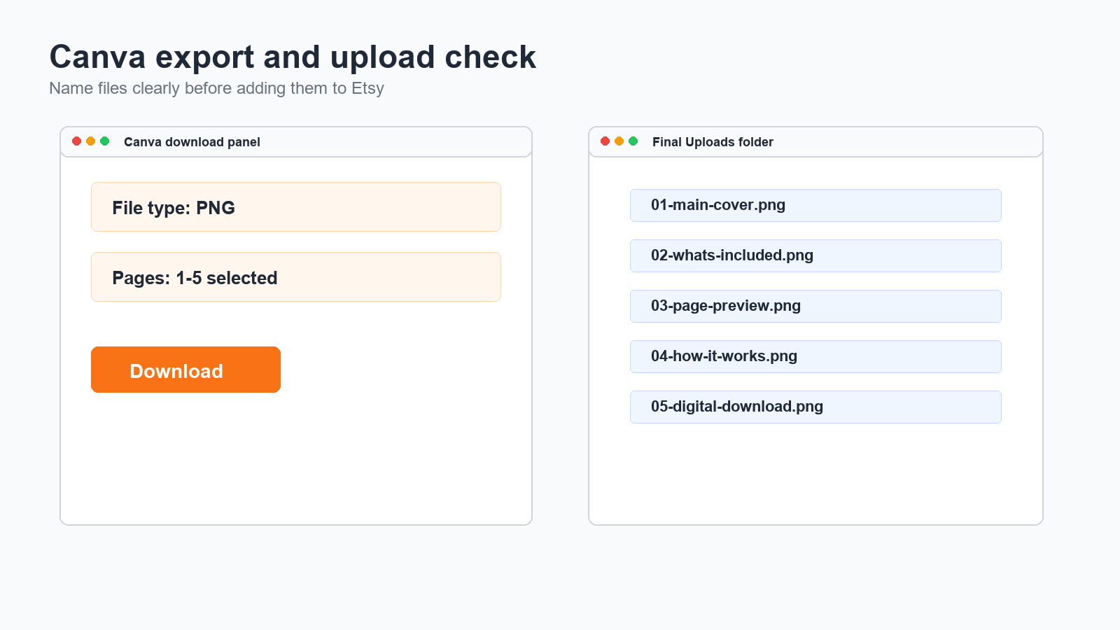
One practical trick is to design around workflow steps. For example, one card can show “Open Canva design, duplicate page, change title, export PNG.” Another can show “Rename files, upload to Etsy, check thumbnail crop.” These tiny labels make the visual feel like a tutorial instead of an ad. They also reinforce the article’s main lesson: the image set is part of the product education.
Check Thumbnail Size And Mobile Crop
After the design looks good on desktop, test it like a buyer on a phone. Etsy listings are often discovered in the grid first, not on the full product page. That means the thumbnail matters. Shrink each card and check whether the headline still reads. If the buyer cannot understand the first image at small size, the card is too busy or the typography is too thin. Fix that before you publish.
Also check the crop. Some words disappear when Etsy crops an image in different spots. Do not put essential text too close to the edges. Keep important words in the middle safe zone. If you use a screenshot, make sure the key area is still visible even when the image is trimmed. This is another reason realistic work-screen visuals beat ornate mockups: they have a clearer center of gravity.
Canva’s Etsy size guidance is helpful here. You want enough resolution that the image remains sharp when uploaded, but the layout still has to be simple enough to survive compression. A buyer should never need to zoom in to understand the headline. If they do, the image is too information-heavy for Etsy search behavior. Simplify the message and repeat it more cleanly.
Turn One Image Set Into A Reusable System
Do not build these cards as one-off art files. Build them as a system. Save the structure, the font pair, the color palette, the spacing rules, and the image order. Then swap in product-specific text and screenshots for the next listing. That is how you move from making one decent listing to making ten consistent listings without starting from scratch every time.
A reusable system is especially useful for digital product sellers because the same visual logic applies across different offers. A Canva template still needs a promise card, a contents card, a preview card, a how-it-works card, and a buyer-fit card. A spreadsheet template needs the same sequence. So does an Etsy SEO checklist. So does an AI prompt pack. Once you own the structure, you can change the subject without changing the workflow.
This is also where automation helps. Use ChatGPT to draft overlay copy, generate alternative headlines, or rewrite long product labels into plain English. Then review the output yourself. The point is not to let AI invent the listing. The point is to speed up the boring part so you can spend more time making the product look clear and trustworthy. That is the real productivity gain for beginners.
What To Do After You Publish
Once the listing is live, watch the behavior. Are people clicking the first image? Are they favoriting but not buying? Are they asking basic questions that the images should already answer? Use those signals to decide whether the first image needs a bigger headline, whether the contents card needs more whitespace, or whether the proof card needs a tighter crop. Make one change at a time so you can tell what helped.
Do not keep polishing forever before launch. Publish the first version when the sequence is clear, the thumbnail is readable, the file type is obvious, and the buyer can understand the product without extra explanation. A clean system will teach you more than endless pre-launch editing. The real lesson comes from feedback, not perfecting the design in private.
That is the practical value of this tutorial. When you can make one strong listing image set in Canva, you can repeat the process for every future digital product. You are not just making pictures. You are building a conversion system. That system is what helps a tiny beginner shop look organized, trustworthy, and worth clicking.
Visual Walkthrough
Realistic screenshot-style examples
Beginner Checklist
- Write the one-sentence product promise before opening Canva.
- Map a five-image sequence with one job per card.
- Use a square canvas and keep the headline readable at thumbnail size.
- Show what is included, how it works, and who it is for.
- Use screenshot-style previews for the actual file or page layout.
- Export clean PNGs and test the crop on a phone-sized screen.
- Match the images to the title, tags, and product file type.
- Save the design as a reusable template for the next listing.
Copy-Paste ChatGPT Prompt
Use this prompt to draft the image copy and quality-check the sequence for one product.
You are my Etsy listing image assistant. I am creating a digital product listing in Canva.

Product:
[paste the product name and type]

Buyer:
[paste the exact buyer]

Goals:
1. Write five Etsy listing image headlines, one for each image.
2. Suggest one short supporting line for each image.
3. Tell me what the visual should show on each card.
4. Rewrite anything vague into plain, buyer-friendly language.
5. Check whether the five images explain what the buyer gets, how it works, and why it is useful.

Rules:
- Do not make it sound like a generic ad.
- Do not use fake income claims.
- Keep the first image readable at thumbnail size.
- Make the file type and buyer benefit obvious.
- Prefer screenshot-style visuals and real product previews.
- Return the five-image plan in a simple table.Current Sources Checked
These public guidance and demand-signal links informed the tutorial.
- Etsy Help: How to Use Tags to Get Found in Search
- Etsy Help: How to Edit Your Listing Photos
- Etsy Help: How to Manage Your Digital Listings
- Canva: Etsy size guide
- Canva: Create Etsy designs
- Recent public seller discussion: listing photos must explain editable vs printable
- Recent public seller discussion: Etsy traffic still depends on strong listing photos
Continue Learning On IdeaVaultHQ
This guide is part of the IdeaVaultHQ Template School path. Use the links below to keep moving instead of stopping on one article.
Success Diagram For This Idea
This is the practical path from reading How To Create Etsy Listing Images in Canva That Explain Digital Downloads Fast to turning the idea into a small testable offer.
Leave a Reply